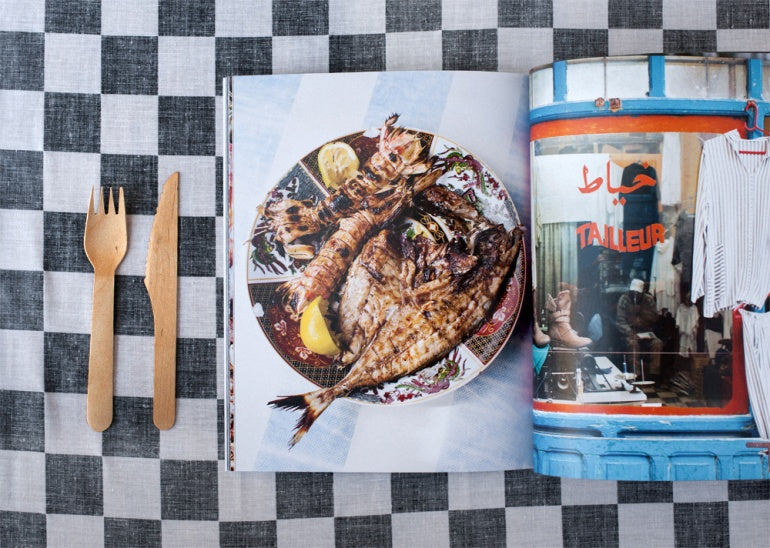
6 Design Tips for Your Next Photo Album

1) Think About Your Album's Purpose
Define the goal of your album to help guide your design; consider things like who your audience will be and why they are looking at your book. Making a portfolio? Highlight your very best work with large images and a minimalist layout. Making an album of a client’s event? Think about chronology and emphasizing the most important moments or moods of the occasion.
2) Group Your Photos Strategically
Like any book, you’ll want to tell a story through your photos from beginning to end; this isn’t limited to just the timeline of the images taken… themes like locations, emotions, and composition can all help create the feeling of a story arch. Try to pair photos with similar tones on a spread to keep cohesion in your collection of images.
3) Room To Breathe
Think of your photo album like an art gallery--you wouldn’t put 50 paintings on the same wall because, even though they may all be part of one collection or show, each piece of art needs to be able to be appreciated on its own as well as part of a whole. So, don’t try to crowd too many images together on a page; this may mean being a bit more selective about which photos you choose to include.
4) Add Variety to Your Layouts
Using the same layout of images page after page is the perfect way to lose the attention of your viewer. Even if you’re only putting one picture on a page or spread, keep it interesting by varying the size, positioning, and orientation (portrait/landscape) of images throughout your album.
5) Large Is In Charge
Size is the strongest way to develop a visual hierarchy in your photo album. What does that mean? The biggest thing on a spread will be noticed first, then the second biggest thing, and so on. So keep the image(s) you want to be the focal point as the largest element on your spreads, and keep text and graphical elements smaller to direct attention to the photos, not take focus away from them.
6) Save Your Images to Print Size
When building your photo album in a print application that utilizes the internet, try to use image files that are the same size (in inches at 300 dpi) that you are printing. If you are using files sized at 16x20 at 300 dpi that will print in your book at size 4x5, you’re using a lot of memory that you don't need and risk crashing the application as you are uploading many files for your book. Additionally, the larger your files are, the longer it takes to upload them to your bookmaker.
(For more info on digital file size vs. print size, read this post).
Happy designing, photogs!

